Ledger > Financial Statements: Statements Over Time |
Top Previous Next |
Hover the mouse over the different menu options. If the cursor changes to a hand (![]() ), then click to go to the subject.
), then click to go to the subject.
![]()
![]()
![]() Financial Statements Over Time
Financial Statements Over Time
Financial Statements Over Time allows you to analyze a company’s financial performance across multiple time periods (monthly, quarterly, annually, or weekly). This helps in identifying trends, patterns, and changes in financial position over time.
Go To: Ledger > Statements > Statements Over Time.
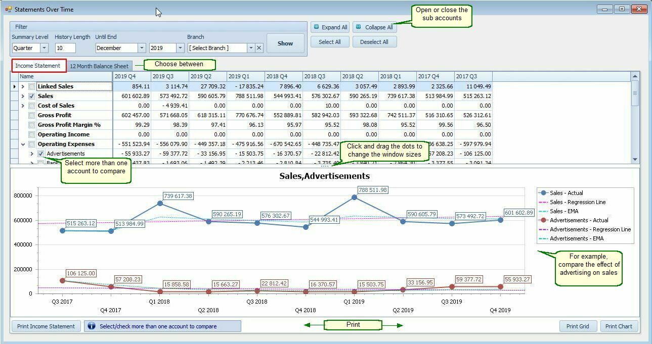
 Customization Options.
Field |
Description |
Summary Levels |
Choose to summarize data by Month, Quarter, Year, or Week.
|
History Length |
Set the number of periods (e.g., 24 Months, 12 Quarters).
|
Until End |
Select the end date for the report (e.g., July 2025). The system will work backward from this date.
|
Branch |
Choose which branch’s data to include. |
![]() Features:
Features:
•Generate reports for:
•Income Statement
•Balance Sheet
•Trial Balance (mix income and balance sheet items in one report)
•Compare Multiple Accounts:
•Combine multiple accounts into a single graph for side-by-side analysis.
Example: View Sales and Inventory trends on one chart.
•Branch Flexibility:
Work with individual branches or generate consolidated reports across multiple branches.
Period Comparison:
•✅ View results side by side across multiple periods.
•Use Month, Quarter, Year, or Week as the summary level—each with customizable period lengths.
•User-defined date range: Not limited to fixed financial periods; you can start and end on any date.
![]() Notes
Notes
•Export formats: PDF, XLS, XLSX, HTML, MHT, CSV, or image file.
•Multi-level reporting: Up to 3 levels deep — e.g., parent accounts with sub-accounts.
•Drill-down capabilities: Right-click any account to open the Account Enquiry form with individual journal entries.
•Flexible display: View in tabular or graphical format, and resize the window to fit your screen and workflow.
•Pivot Grid Option:
•If you need more flexibility, use the Pivot Grid.
•It allows you to drag, drop, and group data by various dimensions such as account, period, or branch — making it easy to customize your own summary views and identify patterns quickly.
•Trends
To help you identify trends, there are 2 techniques, namely linear regression and an exponential moving average (EMA) lines on the chart. - EMA gives more weight to recent data, helping you spot turning points or sustained trends.
Why Use EMA in Smart-IT?
Smoother Trend Lines: Reduces noise from short-term fluctuations.
Better Forecasting: Helps anticipate future performance based on recent momentum.
Visual Clarity: Makes it easier to present financial trends to stakeholders.
Would you like a visual mock-up of how Smart-IT’s EMA graph might look, or a guide comparing EMA vs. simple moving average in financial reporting?
![]() Use Case
Use Case
Ideal for managers, analysts, and accountants who want to:
•Track financial health over time.
•Compare revenue and expenses side by side.
•Forecast based on historical performance.